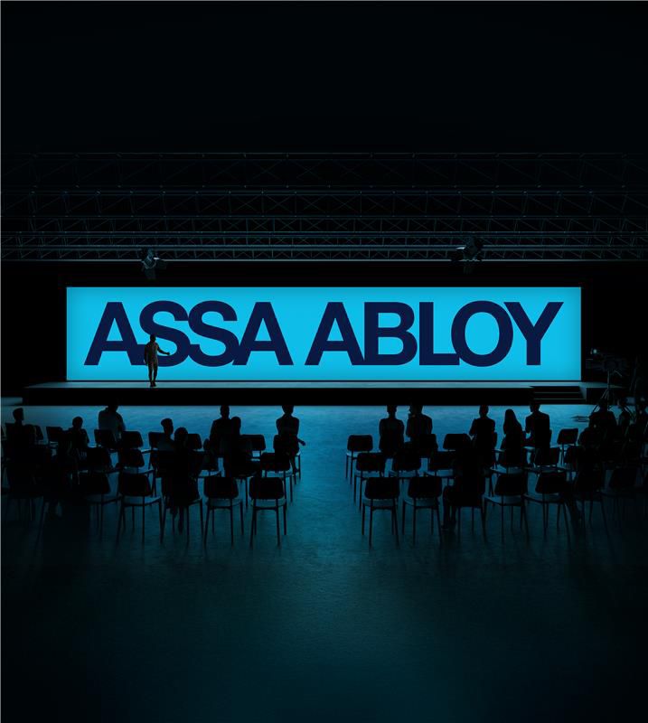
Typography
Typography is the voice of our brand.
Designed to be readable, consistent, and unmistakably ASSA ABLOY – everywhere we speak.
It brings clarity to complex ideas and confidence to every message.
Typeface application
Typeface application
Our typeface is a fundamental part of how ASSA ABLOY expresses its brand. Access Sans is designed to be modern, clear, and confident – supporting strong readability while creating a consistent visual rhythm across all touchpoints. It gives our communication a precise, approachable character, whether used in bold, expressive statements or in everyday informational content.
Typography plays a key role in reinforcing who we are. A clear hierarchy and restrained use of weight ensure our messages are easy to navigate and feel balanced and professional. Color further strengthens this expression, with our signature blue establishing a recognizable and cohesive tone across brand communications.
Where technical, linguistic, or practical constraints apply, carefully chosen fallback typefaces and functional color use ensure continuity without diluting the brand. This approach allows our typography to remain flexible and reliable—adapting to different platforms and contexts while always reflecting the same sense of clarity, trust, and quality that defines ASSA ABLOY.


