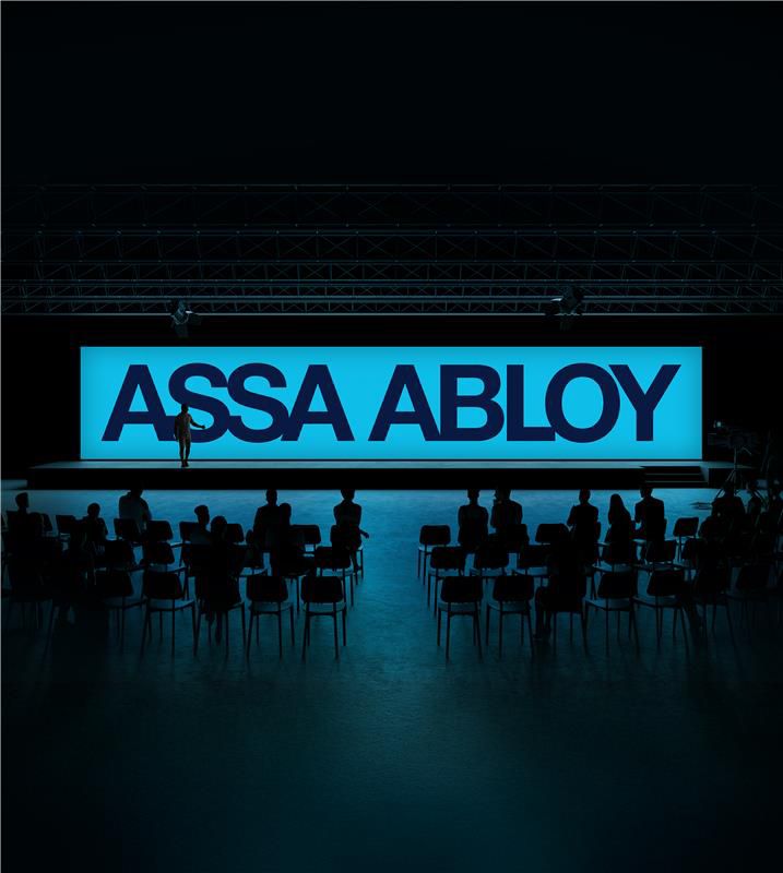
Logotype
The logo should appear in blue whenever possible to strengthen recognition and reinforce our identity as a blue brand. When blue is not practical, approved alternative versions may be used with care.
Primary logo variants and usage
Primary logo variants and usage
Our logo is designed to remain confident and recognizable across contexts. Its primary expressions use our defined blue combinations – Deep Blue on Access Blue, Access Blue on Deep Blue and Deep Blue on Steel Blue – ensuring a unified and unmistakably ASSA ABLOY presence. As a simple rule of thumb: the logo should appear in a blue‑on‑blue expression whenever possible.
When a blue background cannot be used – due to context, materials or technical requirements – the functional black and white variants ensure legibility and impact without compromising brand integrity. These approved options keep the logo consistent through its blue expressions and adaptable through its functional versions, while preventing incorrect combinations such as placing a blue logo on a non‑blue background.
Primary
Logotype in Deep Blue on Access Blue background
Secondary
Logotype in Access Blue on Deep Blue background
Secondary
Logotype in Deep Blue on Steel Blue background
Functional
When the background is white, use the black logotype


Download the ASSA ABLOY logotype
File types
- ASSA ABLOY black logotype(ZIP, 2 MB)


