Brand identity
Logotype
This section outlines how to use the logotype consistently and correctly across different formats and contexts.
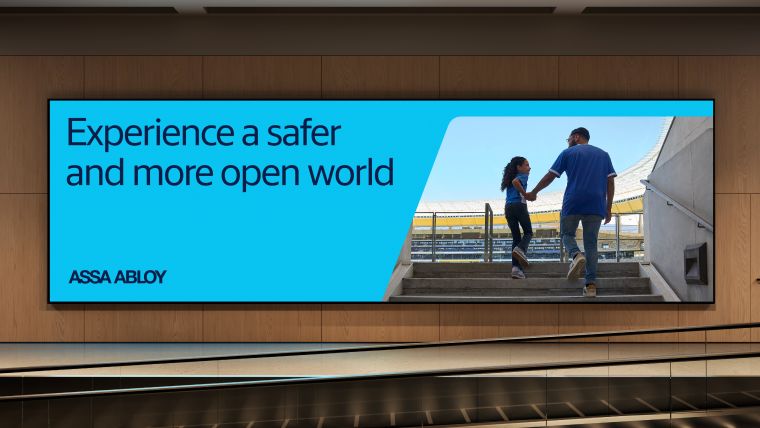
Tagline
Our tagline, "Experience a safer and more open world." is more than a statement. It's our promise.
Colors
This section outlines our updated color palette, their usage, and implementation across various touch points.
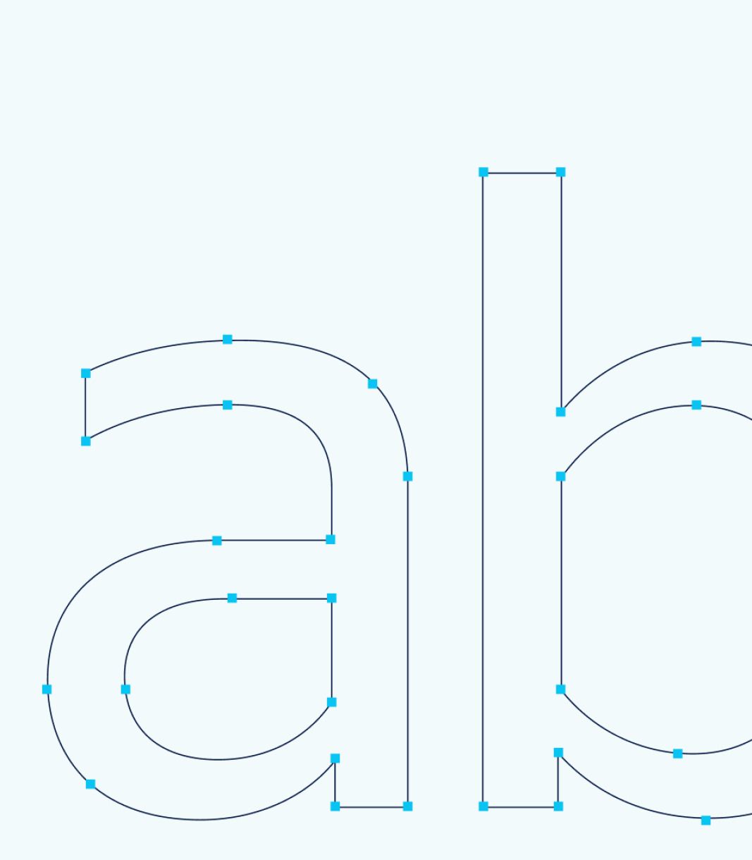
Typography
Typography is a key part of our visual identity. It helps shape how our brand speaks, looks, and feels.
Access shape
Introducing the Access Shape – a visual element shaped by the very DNA of our identity.
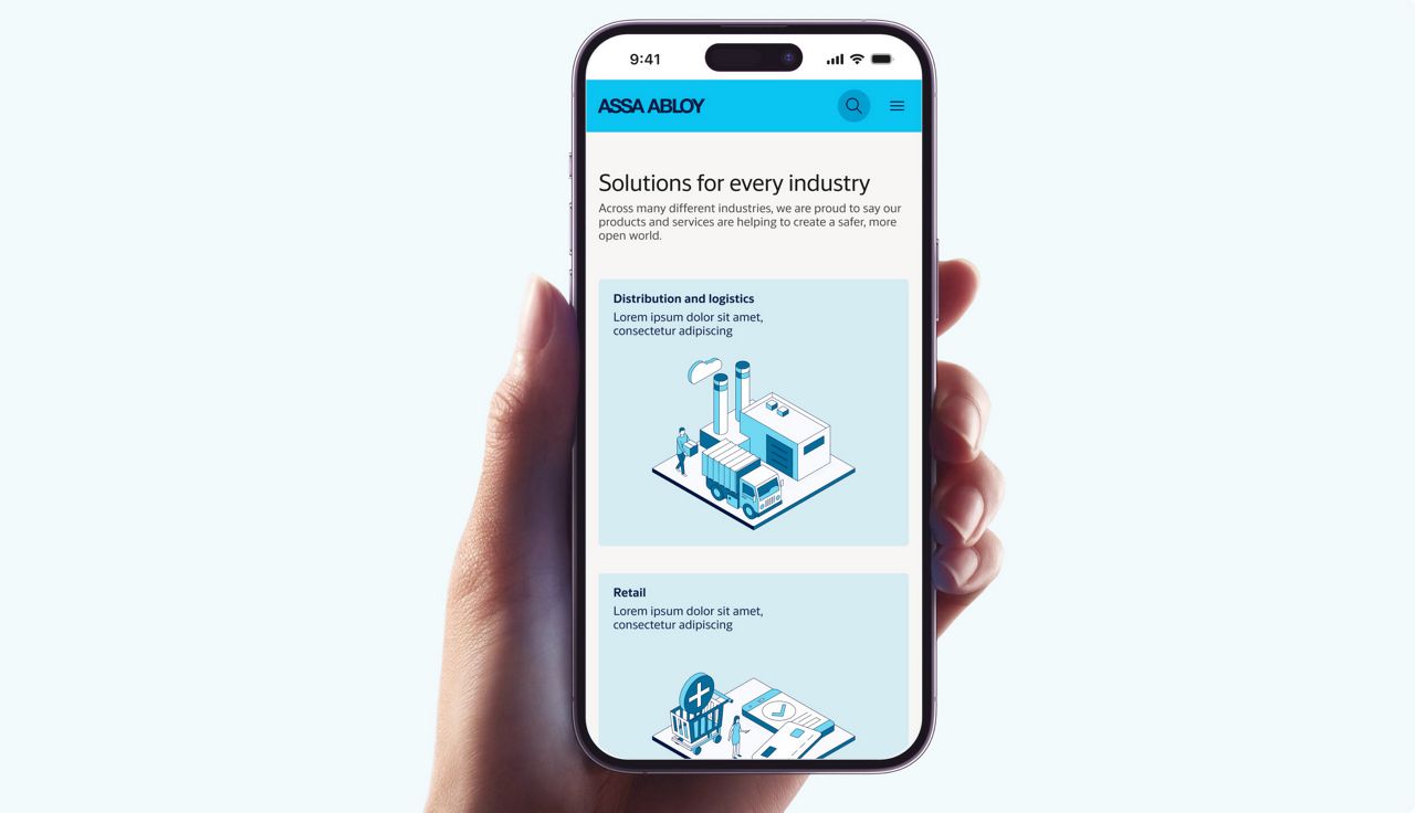
Digital
Our Digital guideline gives you an indepth understanding of the implementation of our brand across apps, websites, eStores and more.