Grids and layout
The grid is the invisible structure that holds everything together. It brings clarity to complexity, making layouts feel balanced and easy to navigate.
This system defines how content is placed, how elements relate to each other, and how layouts are built across formats.
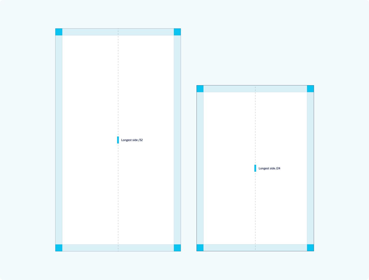
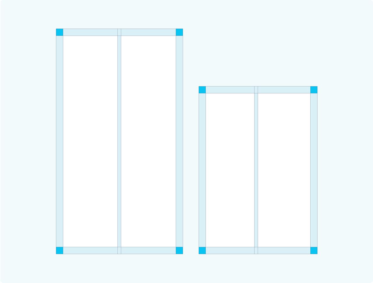
How to use margins and gutters
Margin formula
Defining margins
To ensure adaptability across a wide range of printed and digital formats, we use a responsive approach that maintains clarity and consistency. This principle establishes a coherent foundation and will be embedded into updated templates for seamless application.Long formats
Longest side/32 = MarginStandard format
Longest side/24 = MarginGutter formula
Defining gutters
The gutters are proportionally aligned with the margins, ensuring a balanced and harmonious layout guided by a clear and consistent principle.Margin/2 = Gutter


Grid applications
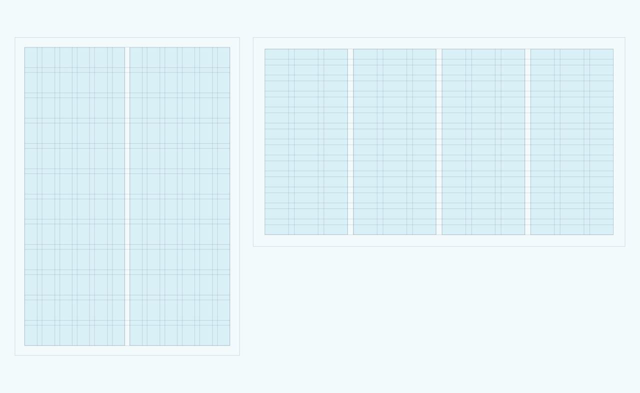
Standard grid
When to use the standard grid
Use the standard grid for simple, structured layouts—like banners, roll-ups and ads. The 12-column system makes it easy to divide space while keeping everything aligned.12 x 12 grid
A 12-column grid offers flexibility, allowing for divisions into 2, 3, 4, 6, or 12 columns for varied yet structured layouts.Editorial grid
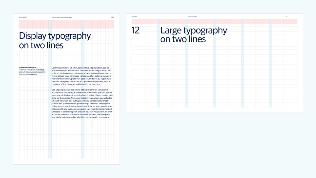
When to use the editorial grid
Use the editorial grid for more complex layouts that include multiple type sizes, weights, text blocks, and images.12 x 12 (using 11 rows)
For editorial layouts, we apply a 12 x 12 grid but ignore the first row.Editorial Grid: Header Placement
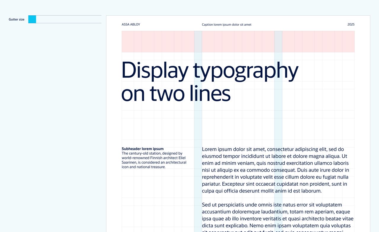
The header typically includes page numbers, section titles, the document name, or other repeating info across pages.
Use the gutter size to define the vertical offset for header. The header is placed from the top, aligned according to the gutter height.