ASSA ABLOY Logo
Download the current official ASSA ABLOY logo in approved formats for digital, print and professional applications. The preferred version is the Deep Blue logotype on an Access Blue background.
Primary logo variants and usage
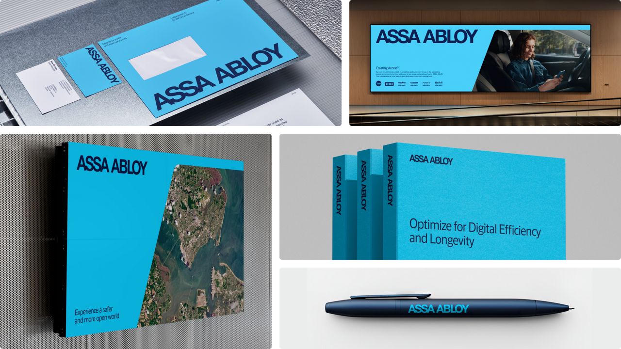
Our logo is designed to be confident, consistent, and instantly recognizable across all applications. The primary and preferred logo expression is Deep Blue logotype on an Access Blue background. This is the most distinctive and strongly associated combination of the ASSA ABLOY brand and should be used whenever possible.
When the primary combination cannot be used, secondary approved expressions are Access Blue logotype on a Deep Blue background or Deep Blue logotype on a Steel Blue background. These alternatives maintain a cohesive blue‑on‑blue appearance and ensure a clear, unified ASSA ABLOY presence across different contexts.
Primary
Logotype in Deep Blue on Access Blue background
Secondary
Logotype in Access Blue on Deep Blue background
Secondary
Logotype in Deep Blue on Steel Blue background



Functional logo use
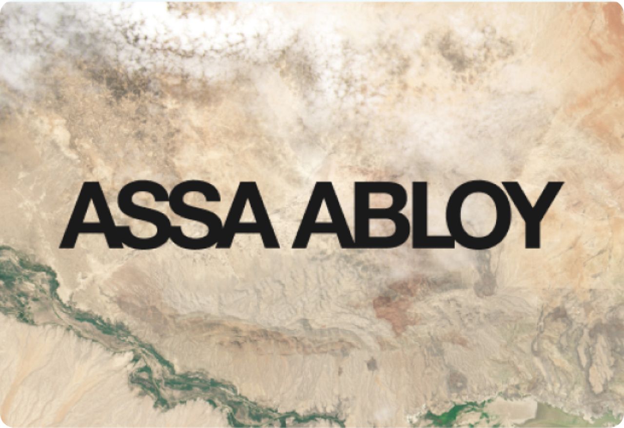
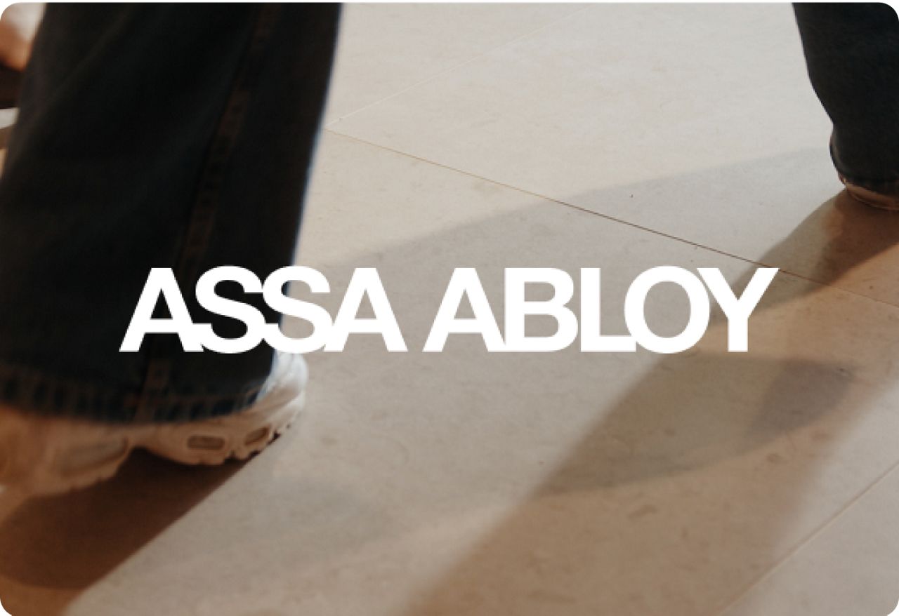
Functional logo use applies only when the primary blue logo expressions cannot be used due to visibility, technical, or production constraints. In these cases, the logo may appear in black or white to ensure clarity and legibility.
This secondary state is intended for black‑and‑white printing, cost‑driven applications such as basic office supplies, or environments where color use is not feasible. Typical uses include imagery, white backgrounds, physical products, exterior signage, and selected promotional items.
Functional
When the background is white, use the black logotype
Functional example
Black logotype on image background
Functional example
White logotype on image background



Clear space
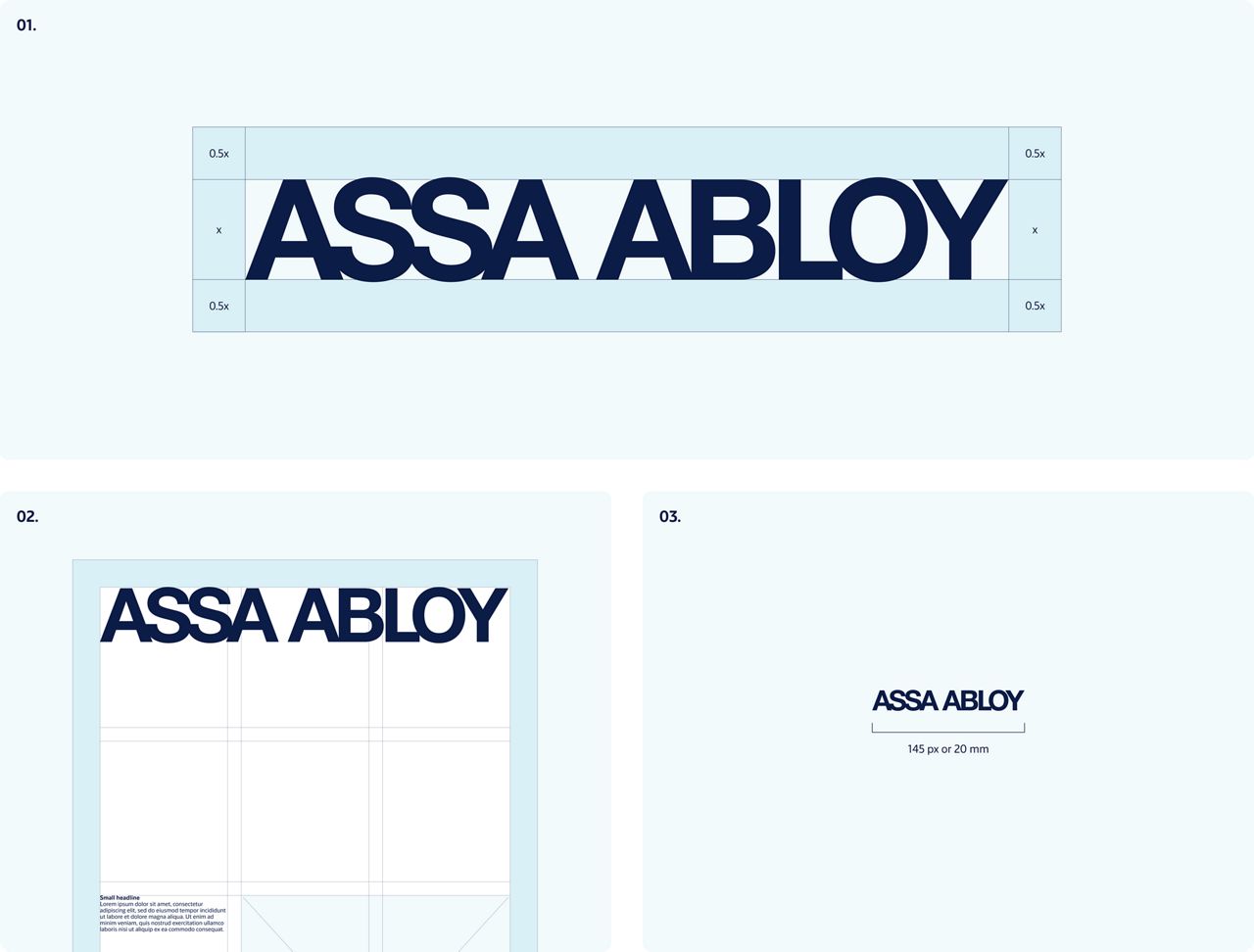
- Minimum clear space
To ensure clarity when the logo is used with text, symbols, or other logos, a minimum clear space must always be maintained. This clear space equals 0.5× the height of the logo (0.5x) on all sides. No elements may intrude into this area. - Clear space and margin
In bold layouts featuring a large logotype, the standard clear space is replaced by a margin defined by the layout formula. This approach is used when deliberately highlighting the brand, such as in marketing communication, exhibitions, or branded merchandise. Refer to the Layout and grids section for details. - Minimum size
To ensure readability and clarity on all screens and digital devices, the logo should not be used at widths smaller than 145 px or 20 mm.

Placement
Placing the logotype
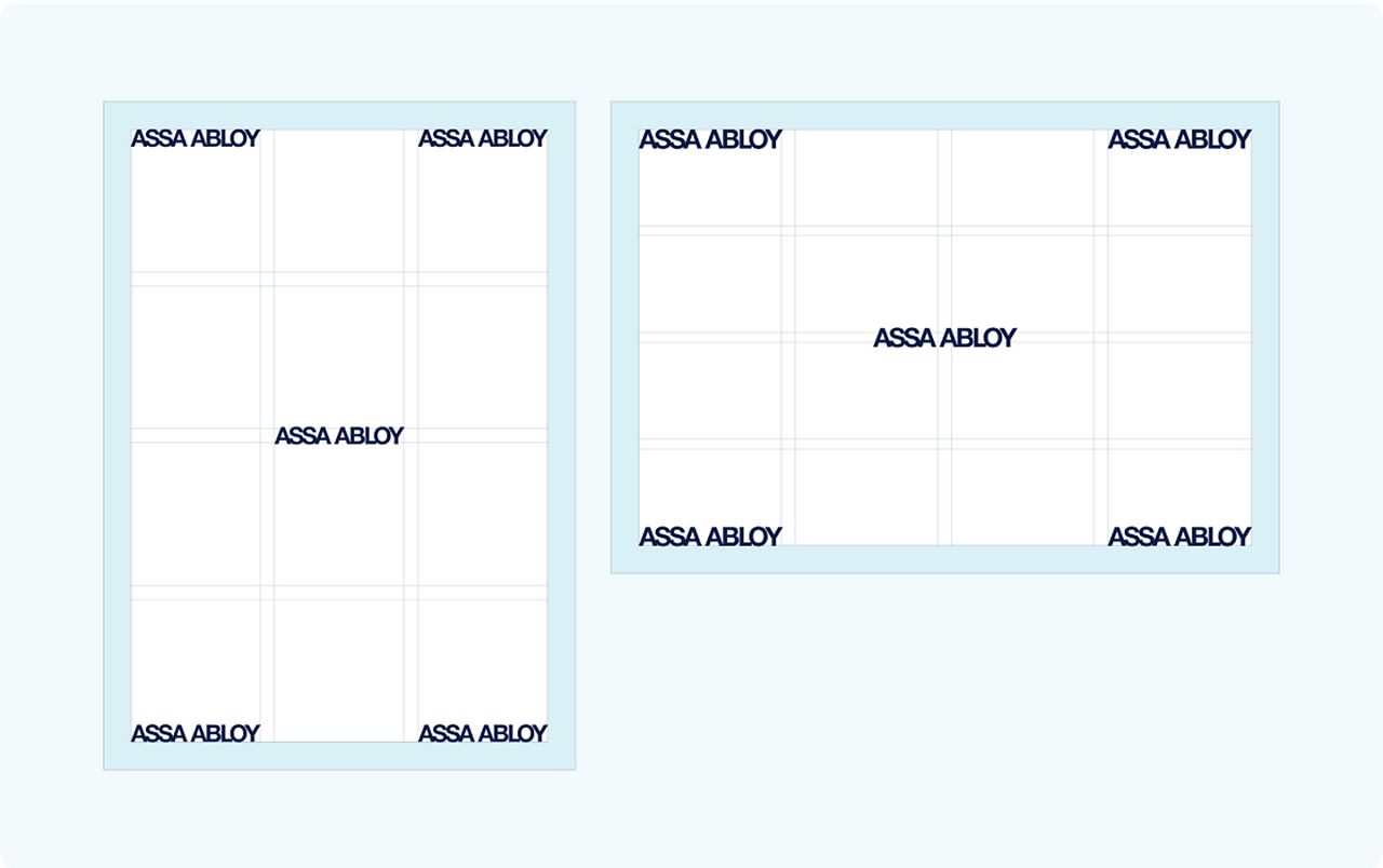
Use one of five placement options, corner or center. Corner placement is preferred for clarity and consistency.

Sizing
Sizing the logotype
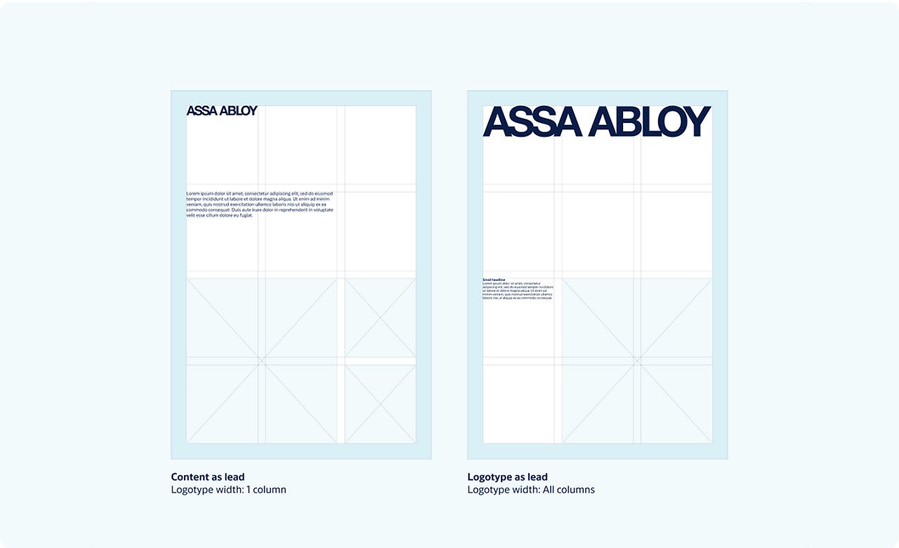
The size of the logotype must adapt to the layout and context in which it appears, balancing clarity with visual impact.
- In detailed or content-heavy layouts (e.g. brochures, datasheets), use a smaller size – typically the width of one column – to maintain clarity and avoid visual clutter.
- In bold, minimalistic layouts (e.g. covers, posters, or hero sections), the logotype can scale up significantly – spanning across all columns, from margin to margin – to create strong presence and impact.
In these larger applications, the standard clear space rule should be relaxed to allow for edge-to-edge placement.


Don'ts
Our logo is one of our most valuable assets. Please use it with care and consistency
Do not rotate or tilt the logo
Do not alter the proportions
Do not use business descriptor logos
Do not add effects
Do not use the logo in white on Access Blue background
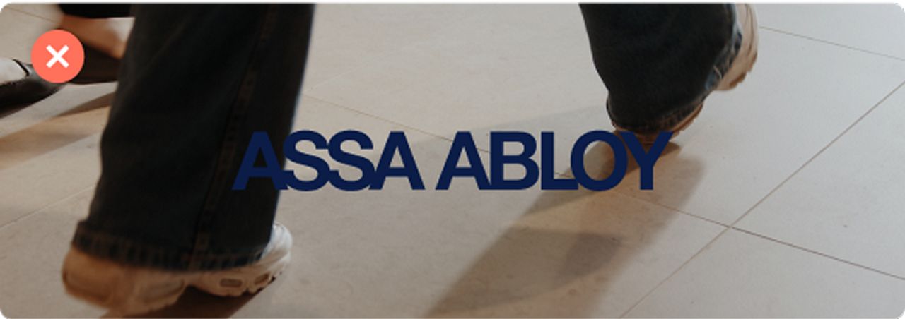
Do not use Deep Blue or Access Blue logo on image
Never recreate the logo using any font – including Access Sans
Do not use unapproved logotype colors.
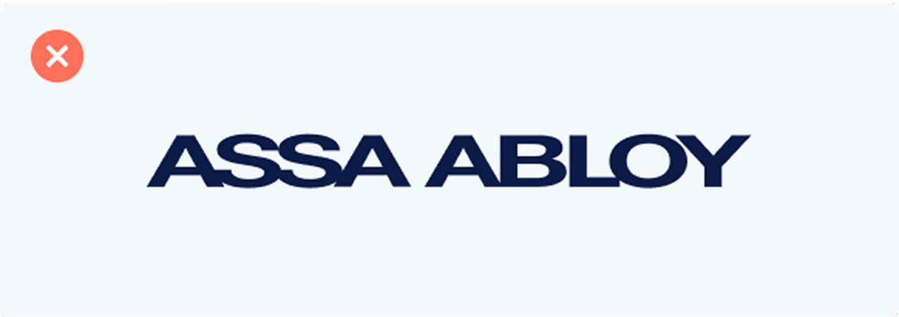
Only the colors specified in this guide are allowed.Do not use the Access Blue or Deep Blue logo on white















Download the ASSA ABLOY logotype
By downloading these logo files, you agree to follow the established brand guidelines and ensure the logo is implemented correctly and consistently.
Logotype principles
Learn more about our logotype, its placement and principles in our brand portal.