Access shape
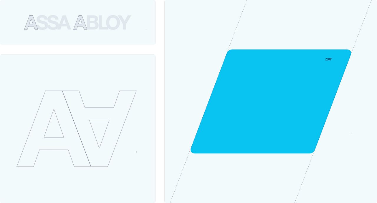
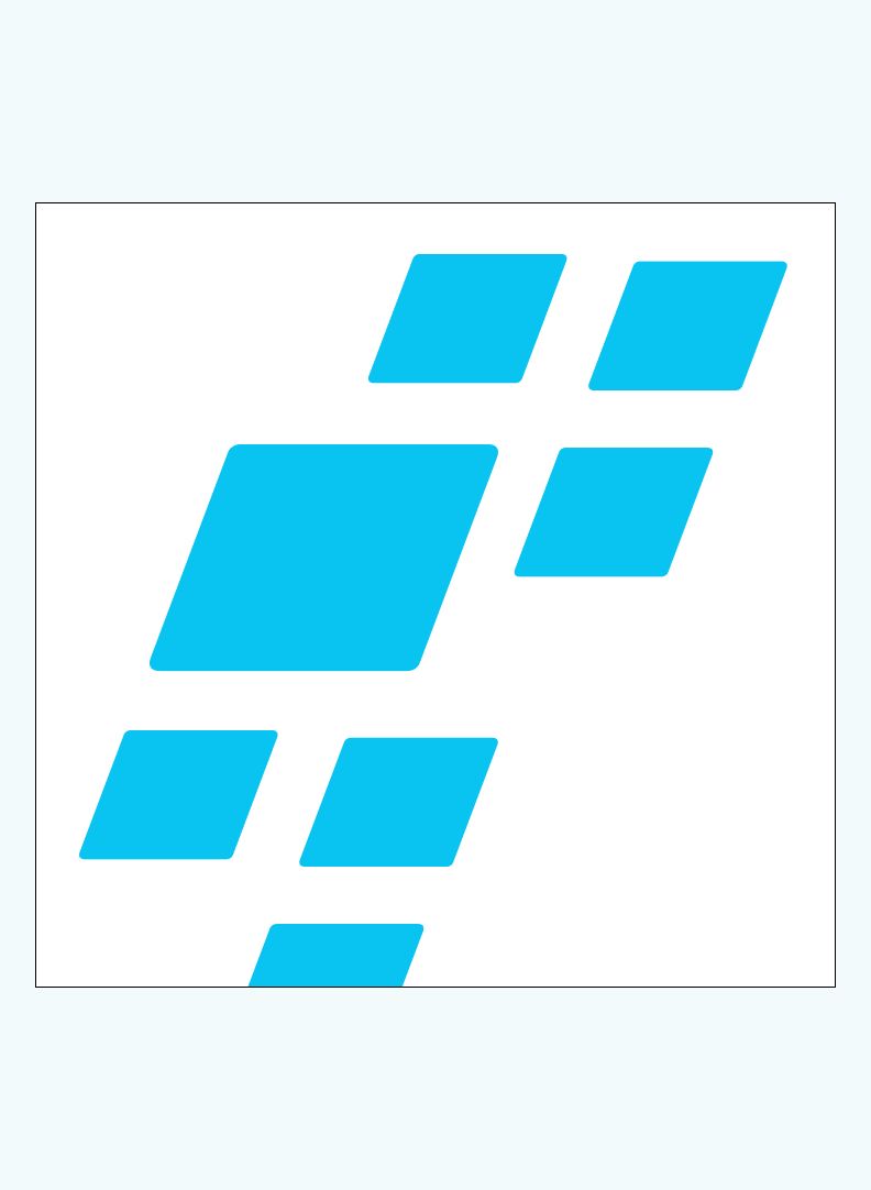
The Access Shape is a core element of our design system – a forward‑oriented visual device that brings clarity, structure and direction to our brand expressions. It guides the eye, frames content and creates a unified rhythm across formats, always anchored in the forward‑leaning angle of our logotype.
Access isn’t static
Introducing the Access Shape – a visual element shaped by the very DNA of our identity. It emerges from the forward-leaning angle of our logotype, cutting through space, shifting perspective, opening new paths. It leads. It reveals.
It’s more than a frame. It’s a portal to something greater. A dynamic invitation to enter what’s next.
Because access isn’t about where you are.
It’s about where you’re going.
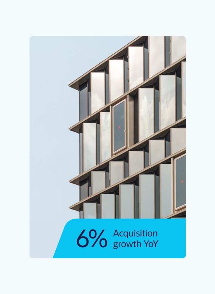
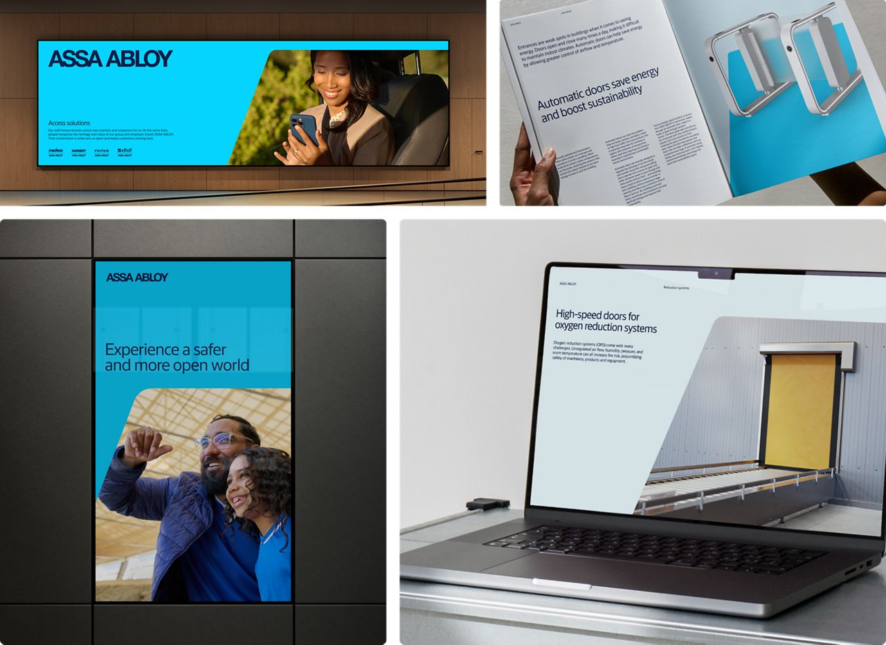
Apply the Access Shape with clear intent – to structure layouts, frame key content and guide attention – never as decoration.
Design DNA
The forward movement
By embracing the angle, stemming from the logotype, we can create dynamic expressions with a forward movement.

Ground rules for the Access shape
Use it with intent
The Access shape is a tool for clarity. Use it when you want to draw attention to important content or structure.
Use the grid
Position shapes with care. Align to layout grids and maintain even spacing to support structure and clarity. Avoid random placement.
Not for decoration
The Access shape is a functional tool that guides attention or supports content. Do not use it as a graphic decoration.



Shape size
Sizing the Access shape
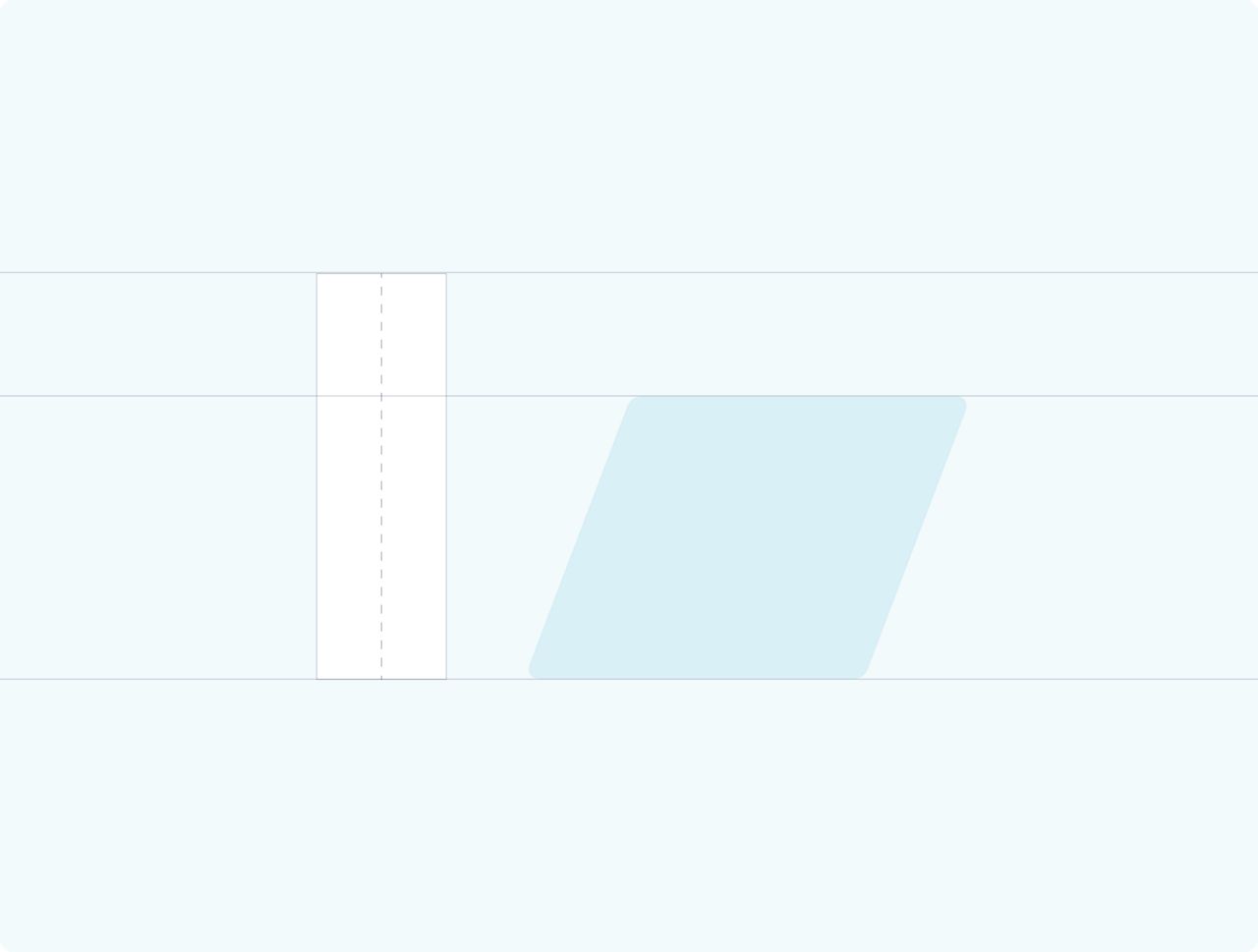
To maintain a balanced and consistent look across formats, size the Access shape based on the layout’s longest side (height or width).
Standard size
Shape height = formats longest side
This principle shall be applied on the most common formats
Alternate size
Shape height = formats longest side * 0.7
This principle shall be applied to narrow and slim formats.




Standard placement 1:1 format
Placement
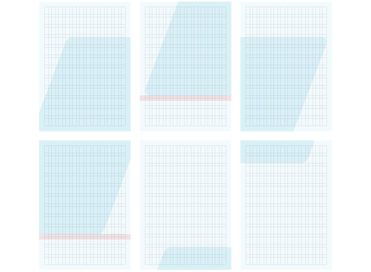
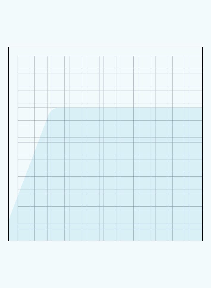
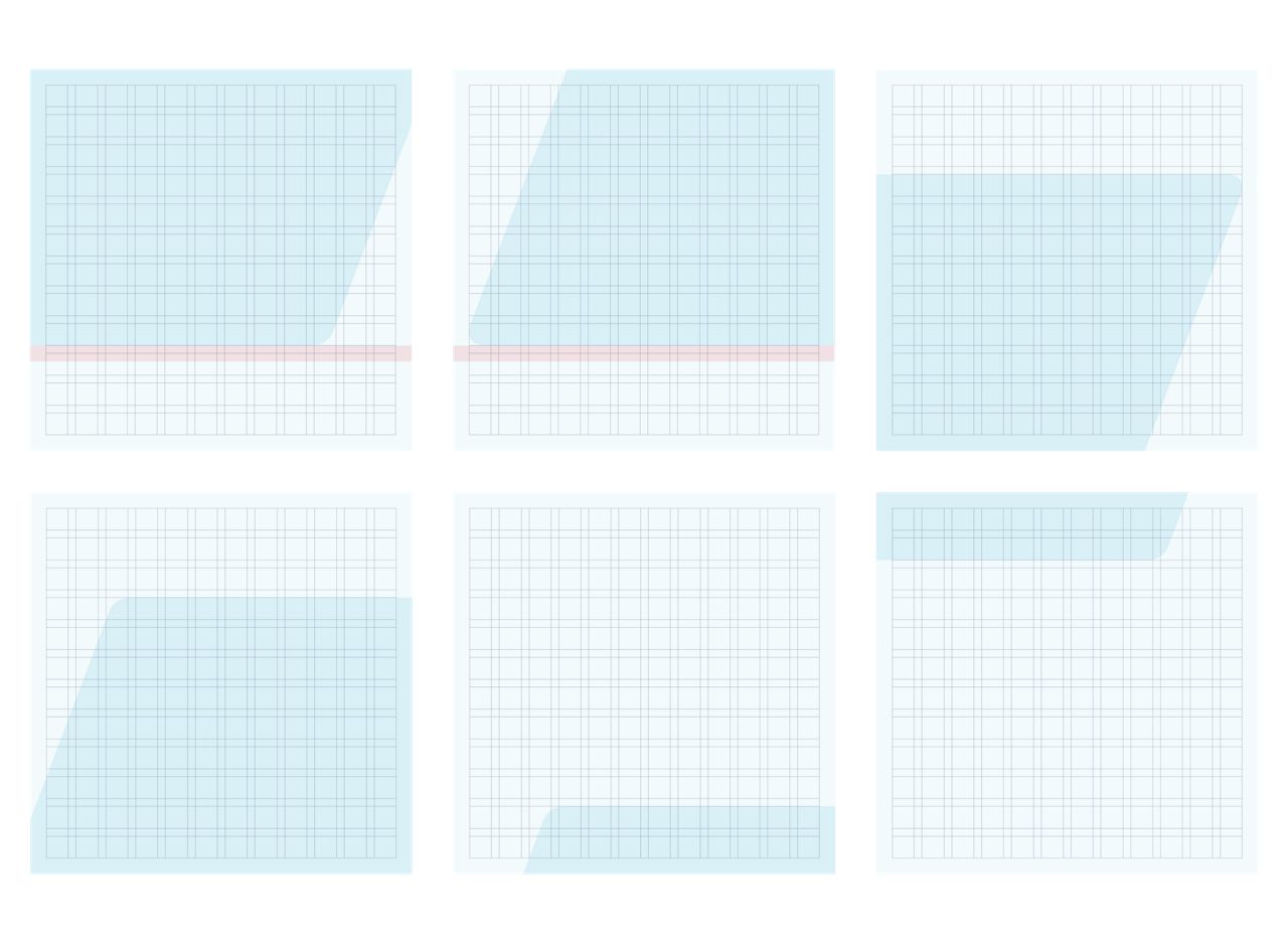
In the examples shown here, you can see the six fixed placements of the blue shape within the grid. These are designed to frame content and create a consistent visual rhythm across formats.
Grid
12 columns
12 rows
Placement follows the defined grid system. See the Grid chapter for more details.
Shape size on display
100% of the longest side

Standard placement 16:9 format
Placement
In the examples shown here, you can see the six fixed placements of the blue shape within the grid. These are designed to frame content and create a consistent visual rhythm across formats.
Grid
12 columns
12 rows
Placement follows the defined grid system. See the Grid chapter for more details.
Shape size on display
100% of the longest side

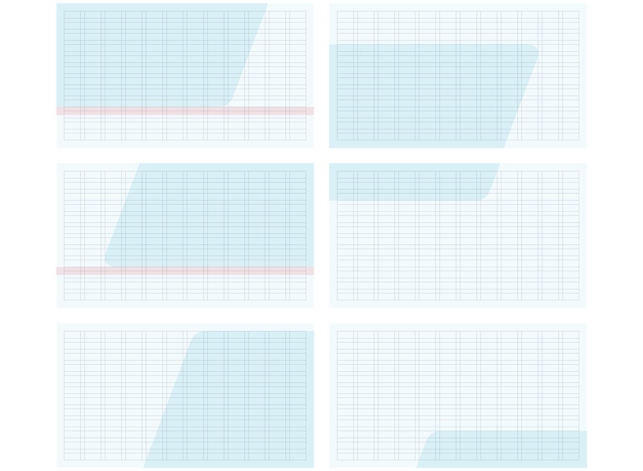
Standard placement in A-format
Placement
In the examples shown here, you can see the six fixed placements of the blue shape within the grid. These are designed to frame content and create a consistent visual rhythm across formats.
Grid
12 columns
12 rows
Placement follows the defined grid system. See the Grid chapter for more details.
Shape size on display
100% of the longest side

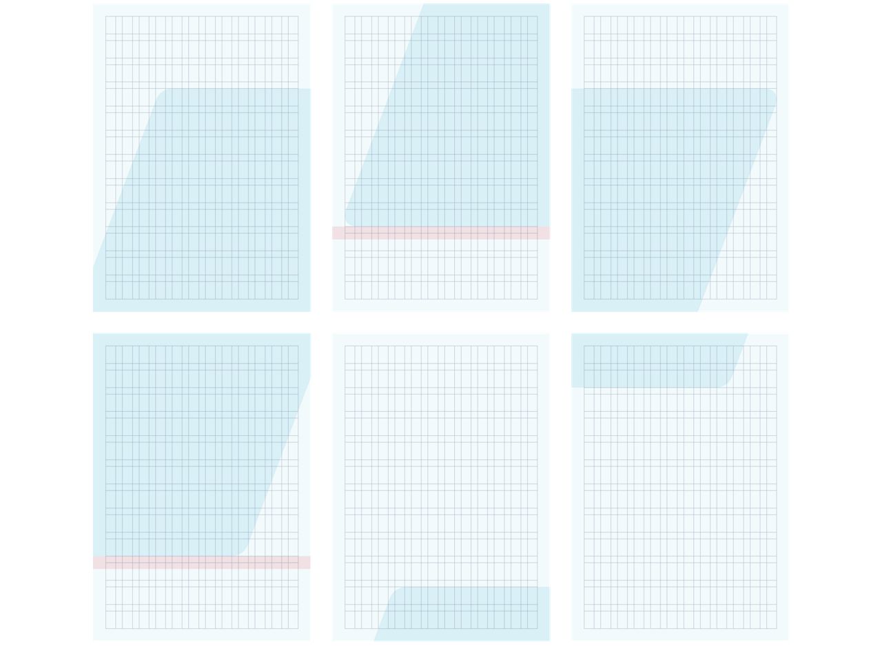
Standard placement in slim format
Placement
In the examples shown here, you can see the six fixed placements of the blue shape within the grid. These are designed to frame content and create a consistent visual rhythm across formats.
Grid
12 columns
6 rows
Placement follows the defined grid system. See the Grid chapter for more details.
Shape size on display
70% of the longest side